Once you click on the "Top Menu" option, the following options get displayed.
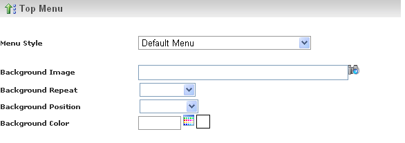
Here you have the option to select the Menu Style.
You can select any one of the two available menu styles. The Menu Styles are:
- Default Menu - It is the simple menu style having basic features and common
text styles.
- Advanced Template - It is a sophisticated menu style having advanced features
and attractive text styles.
If you select the Default Menu as your Menu Style, then the following options get
displayed.
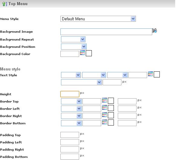
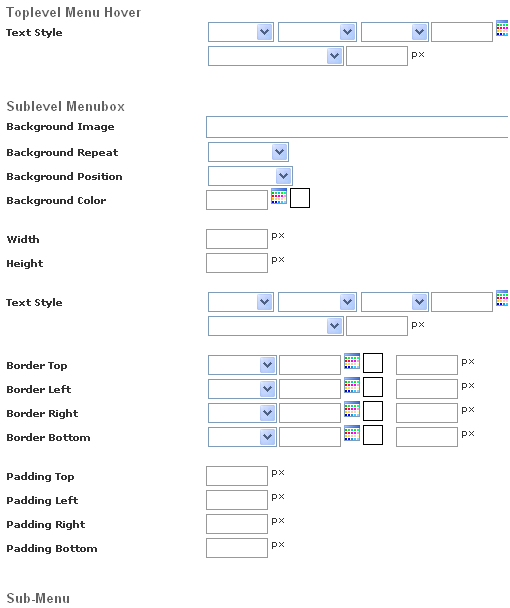
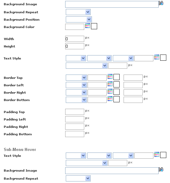

A Menu bar is a region of a screen or application interface where drop down menus
are displayed.
You can change the appearance of the menu by setting the values in
Menu Style
section.
When you hover the mouse on the menu, the style of menu will change according to
the style specified in
Top Level Menu Hover section. Sub level
Menu box displays the set of sub menus present below each Top Menu. You can set
the style for
Sub level Menu box in the Sub level Menu box section.
Sub level menu box resides below the Top Level Menu, when you click on any top level
menu item which contains the sub menu items, sub menus appear. We can set the style
for the sub menus using
Sub menu section.
When you hover the mouse on the sub menu, the style of sub menu will change according
to the style specified in
Sub Level Menu Hover section.
If you select the Advanced Template as your Menu Style, then the following options
get displayed.
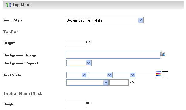

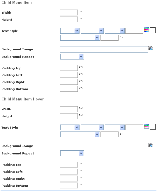
Top Bar is the Title bar which is present at the top of the website.
This contains a list of Menu Blocks , and each menu block inturn consists of a series
of Menu Items aligned vertically. Each menu corresponds to a specific functional
module, and each subsequent menu item under it, corresponds to each individual functionality.
Child Menu resides beneath the main menu. Child menu appears only when the main
menu is clicked. Child menus corespond to the various sub-functionalitties present
in the main functionality of the main menu. Child menu is the sub set of the main
menu.
When the mouse pointer is hovered on the menu item, the color of the menu item changes.
This is known as Menu Item Hoover.
There are various options available in the Advanced Template Menu Style; they are
specified below with their functionality.
Top Bar - Used to design the Title bar of the website.
Top bar Menu block - Used to design the Menu Block in the top bar.
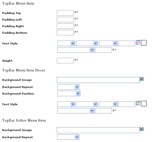
Top Bar menu Item - Used to design the menu item in the top bar.
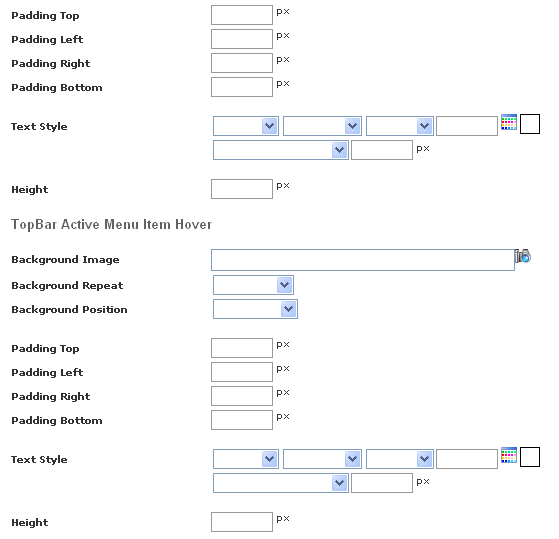
Top Bar Menu Item Hover - Used to design the Menu Item Hover in the Top Bar.
Top Bar Active menu Item Hover - Used to design the Active menu Item Hover in the
Top Bar.
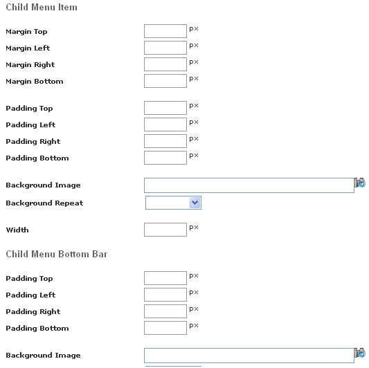
Child Menu Item - Used to design the Child Menu Item.
Child Menu Bottom Bar - Used to design the Child Menu for the Bottom Bar.
Child Menu Item - Used to design the Child Menu Item.
Child Menu Item Hover - Used to design the Item Hover for the Child Menu.